Lively Logic
Developed by James Rodovich
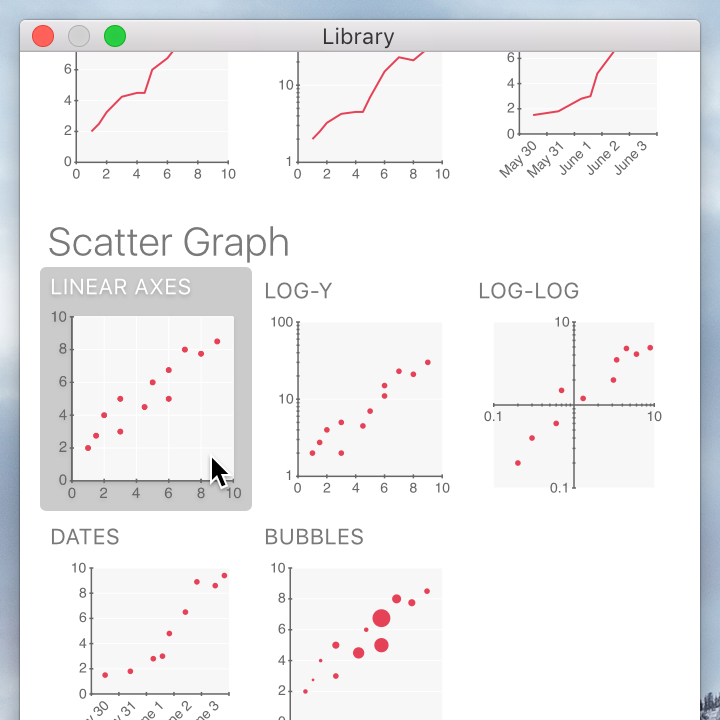
The Library window includes several commonly-used table and graph types, as well as text blocks and basic geometric shapes. Drag a chart from the Library window to add it to your document.
Tables can have more columns or different column types than just the options you see in the Library window, and graphs can have multiple series or different series types. If you don’t see anything in the library that’s exactly what you want, just start from something that’s close and then customize the table columns, graph axes, or data series from there.
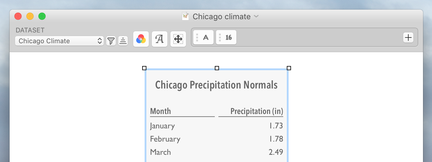
Once you’ve added a table to your document, click the table to select it. You can move it by dragging, and you can resize it using the boxes at its corners. You can resize its columns by clicking in the gap between two columns and dragging left or right.
To give the table a title, click “Add Title” and start typing. If it already has a title, you can double-click the title to change it.
When a table is selected, the inspector bar lets you set its dataset, colors, fonts, and sizes, and configure each of its columns.
From the Dataset pop-up menu, you can choose the dataset whose values the table will display. For more about datasets, see the “Entering data” guide.
The Filter  button opens a panel that lets you filter the data in the table. For more about filtering, see the “Filtering and highlighting” guide.
The Sort  button opens a panel that lets you sort the data in the table.
The Colors  button opens a panel that lets you change the table’s color scheme. You can choose from one of the built-in color schemes or customize each color individually.
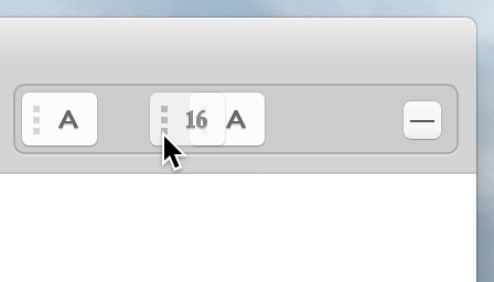
The Fonts  button opens a panel that lets you choose the fonts used in the table’s title, column titles, and rows.
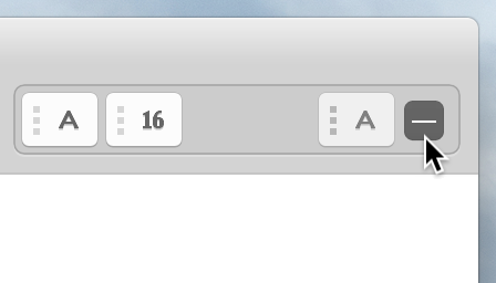
The Sizes  button opens a panel that lets you set the table’s row height and the amount of padding between rows and columns.
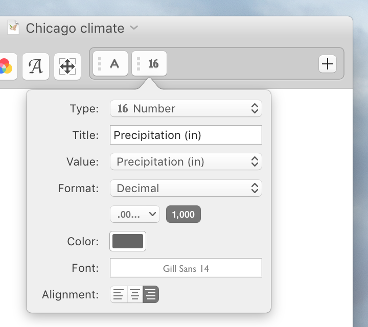
At the right of the inspector bar is a group of buttons for the table’s columns. To configure a column, click the column’s corresponding button in this group. In the panel that appears, you can change the column’s type, set its title, choose which data field or fields it displays, and configure any of its other properties.
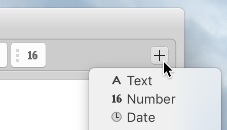
To add a column, click the + button at the right end of the group and choose the new column type. To rearrange columns, click the textured part of a column’s button and drag to the left or right. To remove a column, drag its button to the −.
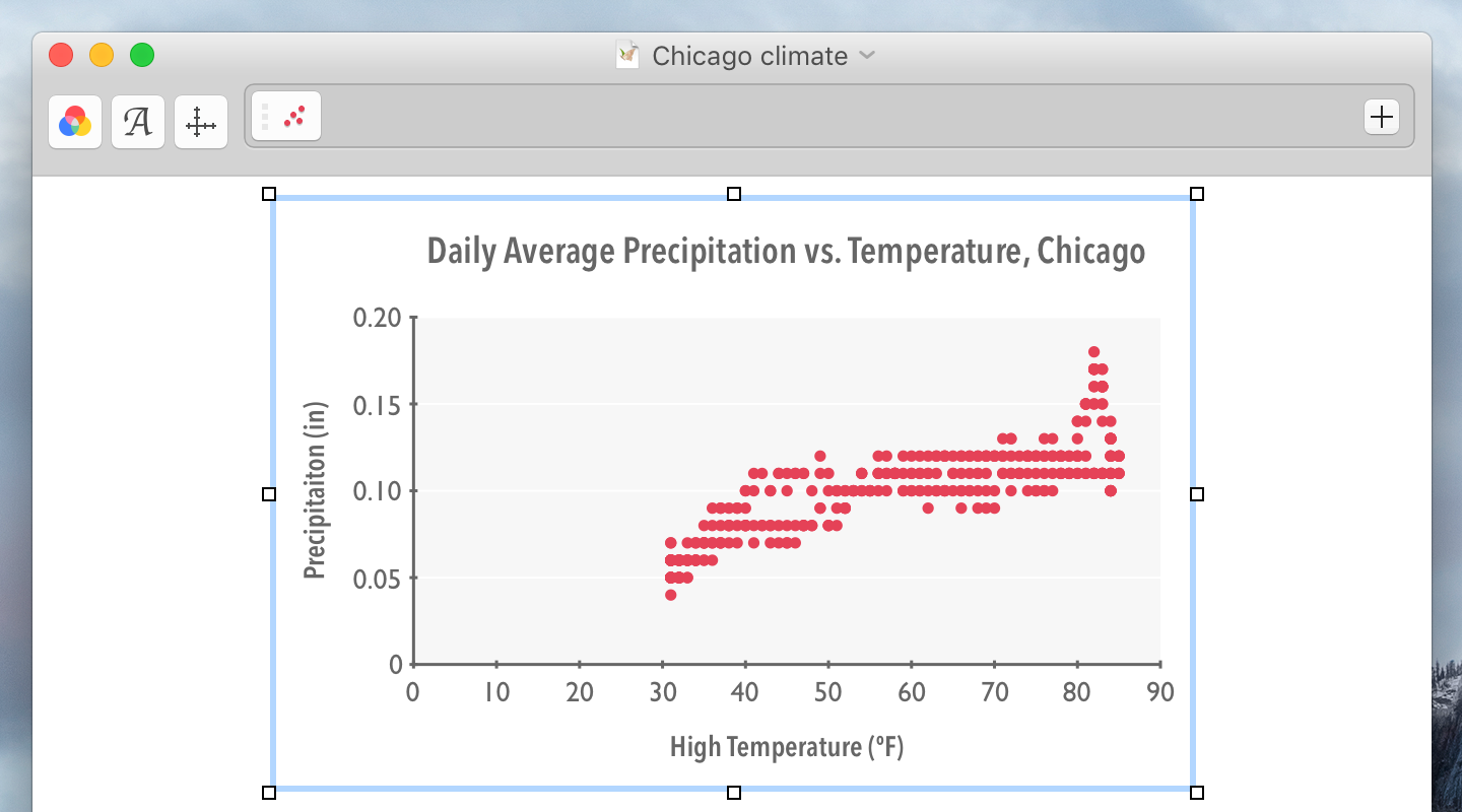
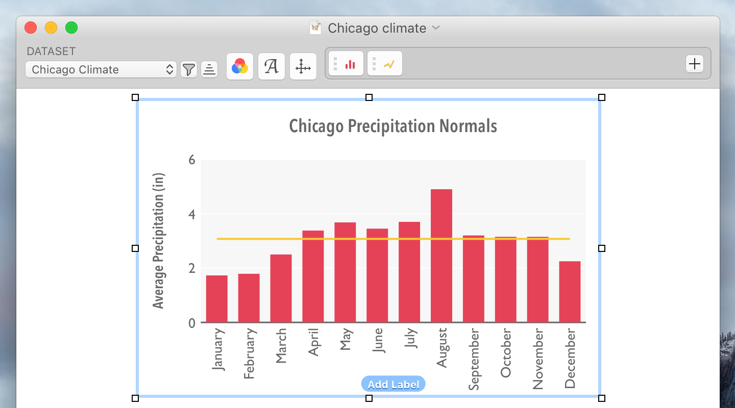
Once you’ve added a graph to your document, click the graph to select it. You can move it by dragging, and you can resize it using the boxes at its corners.
To give the graph a title, click “Add Title” and start typing. If it already has a title, you can double-click the title to change it. Similarly, you can add axis labels by clicking “Add Label” and change the label by double-clicking.
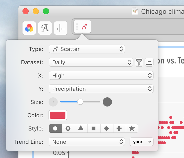
There are two basic types of graphs: X-Y graphs and category graphs.
X-Y graphs have two numeric axes. Each axis can be linear or logarithmic, or use date values. Since both of an X-Y graph’s axes are numeric, each series can use a different dataset, and for each series you will have to specify both the horizontal (X) and the vertical (Y) values to be displayed.
Category graphs have one numeric axis and one category axis. The category axis is divided into evenly-spaced regions, one for each entry in a specified dataset. Each series in a category graph uses the same dataset.
The line graph, scatter plot, and bubble graph options in the Library window are X-Y graphs; the bar graph and timeline options are category graphs. However, it is possible to use any type of series in either graph type.
When an X-Y graph is selected, the inspector bar lets you set its colors and fonts, and configure its axes and each of its series.
The Colors button opens a panel that lets you change the graph’s color scheme. You can choose from one of the built-in color schemes or customize each color individually.
The Fonts button opens a panel that lets you choose the fonts used in the graph’s titles, labels, and text series.
The Axes  button opens a panel that lets you customize the horizontal and vertical axes. In this panel you can set the axis titles, ranges, and step sizes, and format the labels drawn along the axes.
At the right of the inspector bar is a group of buttons for the graph’s series. Each of these buttons opens a panel containing the options for the corresponding series. You can add a new series by clicking the + button at the right side of this group, reorder a series by dragging the textured part of the series’s button, or remove a series by dragging its button to the −.
In addition to the options that are shown in the inspector bar for X-Y graphs, a category graph has controls for choosing its dataset and for filtering and sorting the dataset’s values.
From the Dataset pop-up menu, you can choose the dataset whose values the graph will display.
The Filter button opens a panel that lets you filter the categories in the graph. For more about filtering, see the “Filtering and highlighting” guide.
The Sort button opens a panel that lets you sort the categories in the graph.
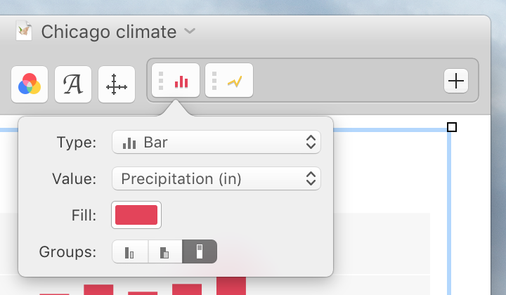
At the right of the inspector bar is a group of buttons for the graph’s series. To configure a series, click the series’s corresponding button in this group. In the panel that appears, you can change the series’s type choose which data field or fields it displays, and configure any of its other properties.
For each series in an X-Y graph, you can choose the dataset to display and how to filter or sort its values. You’ll also have to specify both the horizontal (X) and the vertical (Y) values to be displayed.
For series in a category graph, you only need to specify values for the graph’s numeric axis, because the graph’s category axis is divided into evenly-spaced regions for each entry in the graph’s dataset.
To add a series, click the + button at the right end of the group and choose the new series type. To reorder series, click the textured part of a series’s button and drag to the left or right. To remove a series, drag its button to the −.
![]() © 2012–2026 James Rodovich.
All rights reserved.
© 2012–2026 James Rodovich.
All rights reserved.